
If you only run one type of B2B SaaS content campaign for the next 12 months, run comparison content. Comparison pages convert at three to six times the rate of informational content because the searcher has already decided to buy something in your category. They are not learning. They are choosing. A page that helps them choose well, with substance, is worth more pipeline than 30 informational blog posts.
This is the structure, the honesty principle that 90 percent of agencies refuse to follow, and the conversion math that explains why a CMO should fund six comparison pages before they fund another ungated whitepaper.
01 / Why comparison content converts so well
The B2B SaaS buyer running a comparison query has already done the diligence. They know the category exists. They know there are multiple options. They are evaluating two or three specifically. The page that helps them make that evaluation is the page that earns the demo request.
The conversion math is hard to argue with. An informational top-of-funnel page converts at roughly 0.3 to 0.8 percent of visitors to demo. A high-quality comparison page converts at 2 to 5 percent. With equivalent traffic, the comparison page produces six to fifteen times the pipeline. Add in that comparison searchers are statistically much closer to a buying decision (typical sales cycle on comparison-page-sourced leads is 30 to 50 percent shorter than informational-page-sourced leads), and the asymmetry compounds.
There is a second-order effect that compounds further. Comparison pages get cited inside sales calls. A buyer who reads your honest comparison page before the demo arrives pre-qualified, pre-objected, and ready to talk pricing. The AE spends the call on fit, not on category education. Win rates on those deals run roughly 1.5 to 2 times the deals sourced from informational content.
This is why every B2B SaaS company we work with builds out comparison content within the first six months of an engagement.
02 / The honesty principle (the unlock most agencies miss)
A B2B SaaS comparison page that claims your product wins on every dimension is filtered out as marketing copy in the first paragraph. The buyer reads "we are better than Competitor X at scaling, security, integrations, pricing, and customer support" and closes the tab. They have read this page on every vendor's site and learned to ignore it.
The unlock is admitting where you genuinely lose.
A comparison page that says "Competitor X is better for enterprise teams over 500 seats because their permission system is more granular. We are better for teams of 50 to 250 because our setup time is significantly faster" establishes credibility for every other claim on the page. The conversion lift from a page written this way versus a marketing-copy page is typically two to four times.
Three rules for the honesty principle in practice.
First, every honest concession needs a "why this matters" line. "They are better at X" is not enough. "They are better at X, which matters if you have these conditions" gives the buyer a frame to self-qualify. Half your readers will read your concession and conclude they are not in the failure-mode segment. That is a win.
Second, do not concede on dimensions you genuinely win. False humility reads as badly as false confidence. If your onboarding is faster, say so with a number.
Third, get sign-off from the product team. They will know the dimensions where you are weakest, and the page is more credible when product owns the language. Marketing-only comparison pages are usually too defensive on the wins and too vague on the losses.
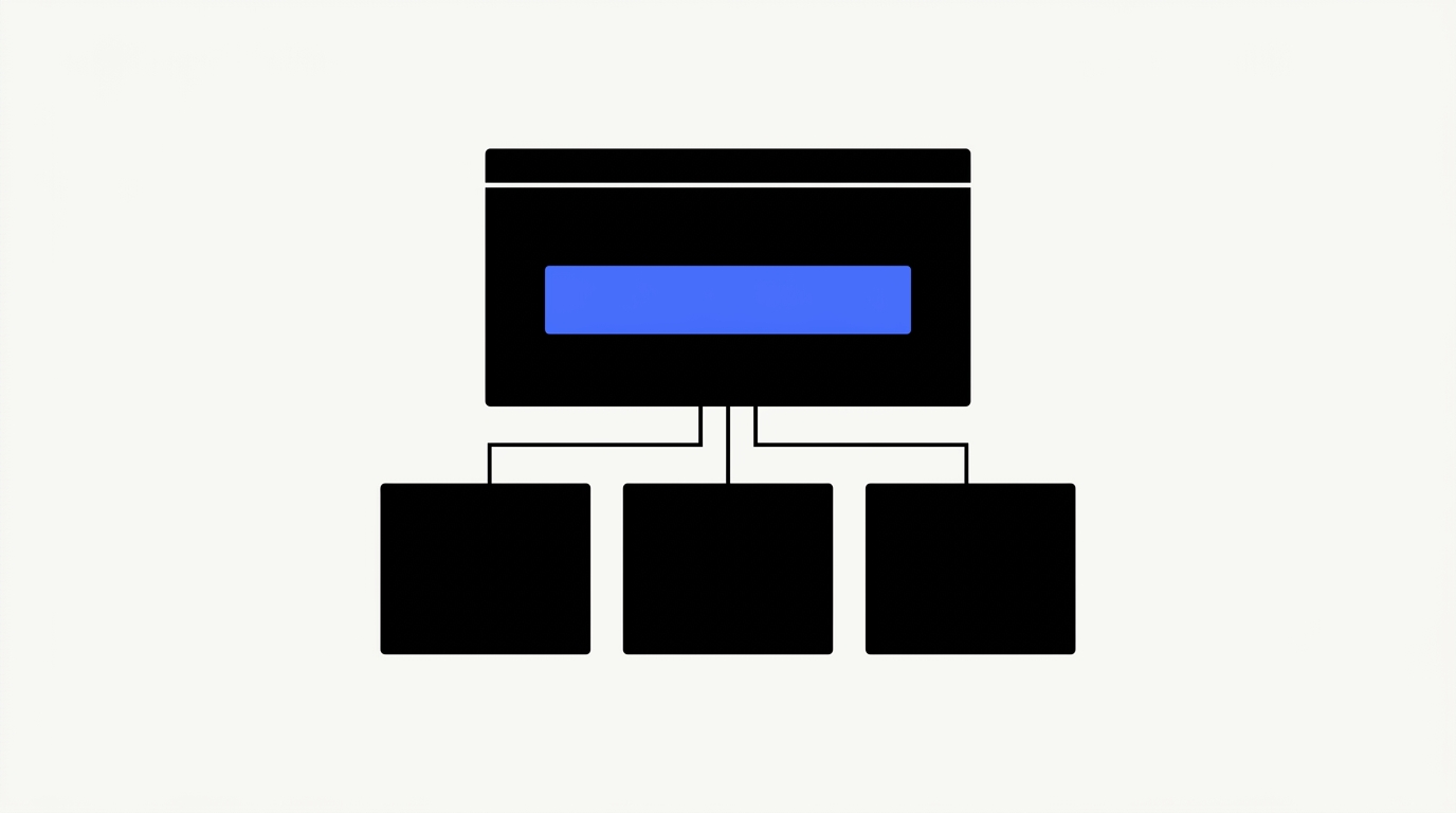
03 / The seven sections every comparison page needs
This section details the seven essential components of a high-performing comparison page. Each element, from the initial verdict block to the final decision tool, serves a distinct purpose in guiding prospects toward an informed choice. Implement these sections to maximize conversion rates and establish your authority.
1. The verdict block (above the fold)
A summary paragraph stating who wins for whom. Two to three sentences, no qualifiers, no "it depends." If the reader stops here, they should still know the answer for their segment. This is the most-read part of the page and the part most agencies under-write.
2. The category context
One paragraph defining the category and what both products are trying to solve. This is for the buyer who is comparing your product to a competitor without fully understanding the category yet. It also gives the page topical authority for category-level keyword variants.
3. The feature comparison (with honest concessions)
Six to twelve feature dimensions with side-by-side comparison. Avoid the 40-row checklist; pick the dimensions that actually decide the deal. Each row should have a one-line summary, not just a green check or red x. The honest losses are what make the wins credible.
4. The pricing comparison
Real pricing, not "contact sales for pricing." If the competitor publishes a price, publish theirs and yours next to it. If neither of you publishes pricing, give a band ("$15 to $35 per seat per month at typical mid-market volume") and explain what drives the spread. Pricing is the single most-searched element on a comparison page and the most common reason buyers bounce when it is missing.
5. The use case verdict
Three to five named scenarios where one product clearly wins. Each verdict is two to four sentences. Examples beat abstractions; "for a 200-person product team running weekly sprint reviews" beats "for medium-sized teams."
6. The migration path
If buyers commonly switch from one to the other, link to or include a migration guide. This converts evaluation-stage readers into switch-intent readers, which is a higher-value cohort. See our migration and switching keywords playbook for how to capture and rank for the switch queries.
7. The decision tool
A short interactive component (calculator, decision tree, scoring framework). It does three things at once: increases time on page, surfaces buyer-fit information you can use in sales follow-up, and earns links from third-party reviewers. See product-led pillar pages for how to build one without a full engineering project.
04 / The five comparison page formats
Effective comparison content strategically deploys distinct page formats. This section details five proven structures, including direct competitor comparisons, multi-product roundups, and use case specific recommendations. Understanding these formats allows you to tailor your content for maximum buyer impact.
Direct vs page (us vs them)
The highest commercial intent format. URL pattern /compare/yourproduct-vs-competitor or /vs/competitor. Targets the "[your product] vs [competitor]" query and its variants. Average word count 1,800 to 2,800.
Three-way comparison
When the search query reflects a three-vendor evaluation ("notion vs coda vs clickup"). Harder to write because the page must be fair to all three, but conversion intent is similar to a direct vs page. Average word count 2,500 to 3,500.
Alternatives roundup
"Top 10 alternatives to Competitor X." High traffic, lower per-visitor conversion, strong mid-funnel role. Useful when your product is the alternative and the buyer is shopping the category. Average word count 2,200 to 3,000.
Best for [use case]
Use-case-led, requires real opinion. "Best CRM for B2B SaaS sales teams under 50 reps." Lower direct-comparison intent but very high relevance for the cohort that lands on it. Average word count 1,800 to 2,500.
Decision framework
Often the highest-ranking format because Google reads it as informational despite the commercial intent. "How to choose a CRM for B2B SaaS." Lower per-visitor conversion than a direct vs page, but higher organic ceiling. Average word count 2,500 to 4,000.
For a Series B B2B SaaS company we typically commission three direct-vs pages, one alternatives roundup, two best-for pages, and one decision framework as the first comparison wave. Each gets briefed using our B2B SaaS content brief template with the verdict block, honest losses, and use-case scenarios pre-defined before the writer touches a draft.
05 / What kills B2B SaaS comparison pages
This section establishes the critical missteps that undermine B2B SaaS comparison content. Avoiding common pitfalls like feature checklists, downplaying competitors, and outdated information ensures your comparisons convert effectively. Learn how to optimize these pages for maximum impact.
Treating it as a feature checklist
A 40-row table with green checks across every column for your product is not a comparison; it is a sales sheet. Buyers know what a sales sheet looks like and they discount it on contact. Comparison pages need feature dimensions chosen because they decide deals, not because they fill a row.
Hiding competitor strengths
Buyers can verify competitor strengths in 30 seconds on G2 or in the competitor's own docs. A comparison page that hides them loses credibility instantly and pushes the buyer to a third-party review site for an "honest" answer, which is usually worse for you than admitting the loss yourself.
Outdated comparisons
Comparison pages need quarterly refreshes minimum. Pricing changes, features ship, positioning evolves. A comparison page that references a competitor's 2023 pricing in 2026 reads as either lazy or dishonest, and buyers do not give the benefit of the doubt. Pair this with our refresh-vs-retire framework so refreshes ship on a calendar rather than on memory.
Not linking to demo
CTA above the fold, in the verdict, in each use case section, and at the bottom. Comparison pages have the highest commercial intent of any content type on the site; the CTA density should reflect that. One CTA at the bottom of a 2,500-word page is the single most common pipeline leak we see on comparison content.
06 / FAQ
This FAQ section addresses common questions about B2B SaaS comparison content. Learn strategy best practices, including how to handle competitor advantages and optimal page structure.
Should we admit when a competitor is better at something?
Yes, on dimensions where you genuinely lose. The honesty principle is the single biggest unlock in comparison content. The lift on conversion is typically two to four times versus a page that claims wins on every dimension.
How many comparison pages should we have?
One per major competitor plus one per high-value use case. For most B2B SaaS companies that lands at six to fifteen pages. Build the direct-vs pages first, then layer in alternatives roundups and decision frameworks once the direct pages are ranking.
Should comparison pages live on /vs/ or as blog posts?
On a /compare/ or /vs/ subdirectory as commercial pages, not buried in the blog. This signals commercial intent to Google, gives sales a clean URL to share, and lets you treat the section as a high-priority cluster for internal linking and refreshes.
How long should a B2B SaaS comparison page be?
1,800 to 3,500 words for direct-vs and best-for formats. Decision frameworks and three-way comparisons run 2,500 to 4,000. Below 1,500 words the page reads as superficial; above 4,000 the verdict gets buried.
How often should comparison pages be refreshed?
Quarterly at minimum, monthly for your top three competitor pages. Refreshes should always update pricing, recent feature launches, and any G2 / TrustRadius shifts in the head-to-head positioning.
 Rizwan Khan