
A regular pillar page is 4,000 words explaining a topic. A product-led pillar page is 4,000 words explaining a topic, with a working version of your product embedded inside the explanation. The reader does not just read about what your product does. They use it, in a contained way, while reading.
The conversion math is not subtle. A product-led pillar typically converts at two to four times the rate of an equivalent-traffic regular pillar, generates 30 to 60 percent more time on page, and produces dramatically higher-quality leads because the reader has already had a hands-on experience before the demo conversation begins.
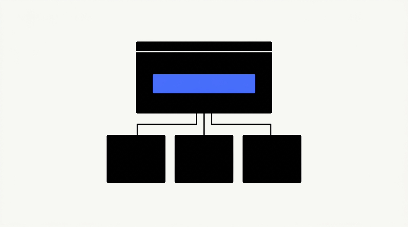
01 / The difference between regular and product-led pillars
A regular pillar page reads as a comprehensive guide. A product-led pillar lets the reader use the product as part of learning the topic. The classic examples: HubSpot's Website Grader, Pipedrive's sales pipeline calculator, Ahrefs's free SEO tools embedded inside their guides, Notion's template gallery, Calendly's meeting scheduler, our own B2B SaaS SEO budget calculator.
The format works because B2B SaaS buying is high-stakes. Letting the buyer experience the product, with no friction, before any sales conversation, dramatically reduces perceived risk. Demo-to-close rates from product-led pillars typically run 1.5 to 2.5 times higher than from regular pillar traffic, and the average deal size is 20 to 40 percent larger because the buyer arrives with a use case already in mind.
There is a secondary benefit that compounds over time. Interactive components attract links from third-party reviewers, journalists, and category curators in a way static guides do not. A working calculator gets cited as "this useful tool from X." A 4,000-word guide gets cited as "according to X's article." The first builds linkable brand equity; the second contributes to topical authority but does not become a backlink magnet on its own.
02 / The four most common formats
Product led pillar pages deliver value through interactive tools. Four common formats consistently drive engagement and conversions. Each format offers a distinct way to empower users and showcase product utility.
The calculator
Pricing, ROI, sizing, capacity, time-to-value. Useful when the product has quantifiable value the buyer is trying to estimate. Examples: HubSpot's ROI calculator, our SEO budget calculator, Stripe's pricing calculator. Best for late-stage commercial intent.
The decision tree
Reader answers three to seven questions, receives a recommendation. Useful when the product has multiple use cases or pricing tiers and the buyer is not sure which one fits them. Best for mid-funnel "which option is right for me" intent.
The audit or grader
Reader inputs their site, account, or data, receives a diagnosis. Examples: HubSpot Website Grader, Ahrefs Site Audit free tool, Mozilla Observatory. Best when the product itself does diagnostic work and the lite version is genuinely useful as a standalone.
The interactive template or builder
Reader builds a sample artifact in a contained version of the product. Examples: Notion's template gallery with editable previews, Figma's free community files. Best when the product's value is in the artifact it produces.
The wrong choice is to build a generic calculator that does not actually use the product. A pricing calculator that pulls from your live API is product-led. One that does spreadsheet math the reader could have done themselves is not, and it underperforms the equivalent static guide.
03 / The eight-section structure
This section details the optimal eight-part structure for product-led pillar pages. Each component, from the initial value proposition to the concluding demo CTA, is strategically placed to maximize user engagement and conversion. This proven framework ensures comprehensive coverage and actionable insights for your audience.
1. Hero with the value proposition for the interactive component
The promise is part of the lead. "Estimate your B2B SaaS SEO budget in two minutes" beats "A guide to SEO budgeting." The reader scans the hero and either commits to the page or bounces; the interactive promise is what earns the commit.
2. One chapter of context (250 to 500 words)
Just enough to set up the interactive piece. Why this calculation matters, what variables it uses, what the typical answer looks like. Resist the temptation to put 1,500 words of context above the tool. Readers came for the interactive component; bury it under setup and you lose the very behavior the page exists to capture.
3. The interactive component itself, above the rest of the article
Embedded, not gated, not behind a sign-up wall. Each piece of friction halves the number of users who get to the value moment. If the legal team requires a sign-up, build the gated version separately and keep the public component free for SEO.
4. The interpretation chapter (500 to 800 words)
"What your result means." This is the highest-attention section of the page because the reader has just received an answer and wants to know what to do with it. Include three to five named scenarios so the reader sees their own situation reflected.
5. The methodology chapter (300 to 500 words)
"How we calculated this." Builds credibility with sophisticated buyers, especially in regulated or technical categories. Skip it on consumer-feeling tools; require it on B2B tools where the buyer's procurement team will read the methodology before the buyer can sign.
6. The use cases chapter (500 to 800 words)
Three to five named scenarios where the calculator's output drives a different decision. Use named industries, named team sizes, named pricing models. Specific beats abstract by an order of magnitude here.
7. The FAQ
Four to six questions. Cover the methodology questions, the "is this accurate for my situation" questions, and the "what do I do next" questions. Mark up with FAQPage schema; see our schema markup playbook.
8. The demo CTA
Soft and contextual. "Want us to walk through your result with you? Book a 30-minute call." The reader has just done work on the page; the CTA acknowledges that work and offers a low-friction next step.
04 / The integration question
The interactive component is engineering work. There are two paths.
The first is a stripped-down API endpoint your product team builds, which the marketing site calls. This stays current as the product evolves and shares logic with the production app, which means the public tool never drifts from the real product. The cost is coordination overhead between marketing and product engineering on every change.
The second is self-contained product logic implemented separately for the article, owned end-to-end by the marketing team. Faster to ship, no coordination cost, but creates maintenance debt: if the underlying product logic changes and no one updates the public component, the tool starts producing answers that contradict the actual product.
Most marketing teams underestimate the engineering hours by 50 to 100 percent. A working interactive component is rarely under 60 engineering hours, and a polished one with input validation, mobile responsiveness, accessibility, and analytics typically lands at 100 to 200 hours. Budget accordingly, and put the engineering scope into the brief from the start so it is not discovered three weeks before launch.
A practical compromise: build the first version self-contained, then refactor to a shared API once the page is proven. Avoid building the API-coupled version on day one for a tool that may not earn its maintenance cost.
05 / How product-led pillars fit into the cluster
A product-led pillar is the head of a content cluster, not a standalone page. See the B2B SaaS content strategy playbook for cluster mechanics.
The cluster pattern: build the product-led pillar first, then ship five to eight supporting cluster posts within the same six-month window. Each supporting post links up to the pillar with a descriptive anchor; the pillar links down to the relevant subset for each section. Each supporting post needs its own brief; see the content briefs template.
Many product-led pillars sit alongside a comparison cluster (see the comparison content playbook) and inherit traffic from it. A reader who lands on a comparison page often clicks through to the calculator to validate the numbers, which is the highest-quality intra-site traffic on the entire content surface.
06 / What kills a product-led pillar
Product-led pillar pages fail when they introduce friction, provide inaccurate or stale information, or disconnect from the product experience. This section details the critical missteps that undermine the effectiveness of product-led content, including a lack of analytical insight into user interaction.
Friction before value
Each piece of friction halves the number of users who get to the value moment. Email gate, sign-up wall, "tell us about yourself first" , every one of these costs you 50 percent of the audience and degrades the SEO behavior signals (time on page, bounce rate) that earned the ranking in the first place.
Inaccurate output
Test the calculator with your sales team before launch. If the AE thinks the output number is wrong for their named accounts, the calculator will undermine sales conversations rather than support them. The fix is usually a methodology adjustment, not a UX change.
Stale data
Quarterly maintenance is non-negotiable. Pricing changes, market benchmarks shift, the product changes. A calculator showing 2024 pricing in 2026 is worse than no calculator at all. Pair this with our refresh-vs-retire framework so the maintenance ships on a calendar.
Disconnected from the product
If a generic calculator could substitute for yours, the page is not benefiting from your product's actual differentiation. The output should reflect something only your product knows: pricing model, integration list, time-to-value, real customer benchmarks.
No analytics on interaction
If you cannot tell which inputs users entered, which outputs they received, and what they did next, you cannot improve the tool. Instrument the component before launch, not after.
07 / FAQ
This FAQ section addresses common questions about product-led pillar pages in B2B SaaS. We cover defining characteristics, development timelines, quantity considerations, and the role of interactive elements and AI. You will also find guidance on measuring success and fitting pillars into your content strategy.
What makes a pillar page "product-led"?
It integrates the product into the educational content rather than treating product mentions as a sidebar or CTA. The reader's experience of the topic is inseparable from their experience of the product.
How long does a product-led pillar take to build?
Six to twelve weeks end-to-end. Budget $15,000 to $40,000 per pillar including engineering time, design, copy, and SME interviews. The high end of the range buys a polished, instrumented, maintenance-light component; the low end buys a working MVP that will need a refactor within a year.
How many product-led pillars does a B2B SaaS site need?
One to three per year is typical. More than that and the team cannot maintain quality and freshness on each one. Less than one per year and the content surface lacks the linkable assets that drive the bulk of high-quality referring domains.
Should the pillar require sign-up to access the interactive component?
No, almost never. The SEO and link-equity benefits depend on the component being public. If you need lead capture, gate the export or the personalized report, not the core experience.
What about AI? Should we use AI inside the interactive component?
Yes, when the AI does work the buyer cannot easily replicate. A simple wrapper around a public LLM is not differentiating and tends to attract spam usage; a domain-specific AI tuned on your product data and benchmarks is. Always disclose the AI's role and rate-limit aggressively.
How do we measure if the pillar is working?
Three metrics: organic ranking on the head term within nine months, demo-request rate from pillar traffic relative to other pillars, and inbound links earned per quarter. A successful product-led pillar wins on at least two of the three within twelve months.
 Rizwan Khan